Introduction to R
Kelsey Andersen & Ravin Poudel & James Fulton
March 18, 2019
Introduction to R Basics
You can use R as a simple calculator:
1+1## [1] 23*2## [1] 68^8## [1] 16777216Objects
To make programming simpler, we usually save values or sets of values that we want to use again as “objects”. We do this using the symbols “<-” (called the “gets arrow”).
a <- 2 + 2
a
## [1] 4b <- a + 2
b## [1] 6Relational operators [ <, >, ==, >=, <=, !=]
Comparing values will return “True” or “False”
2==2 ## "==" means does equal
2!=2 ## "!=" means does not equal
2>=3 ## ">=" means greater than or equal to

# Create an object with values from 1 to 10
num10 <- c(1, 2, 3, 4, 5, 6, 7, 8, 9, 10)

# Which elements are less than 5?
num5 <- num10 < 5

# Check the elements in num5, these are TRUE / FALSE
num5
Vectors
Vectors are a way to set a series of data elements as an object.
v1 <- c(1, 2, 3, 4, 5) #numbers
v2 <- c("hello", "world") #characters
v3 <- c("TRUE", "FALSE", "TRUE") #logical values (also could be - "T", "F", "T")
Lets make a vector with hypothetical ratings of “R expertise” on a scale of 1-10.
WithR <- c(8.5, 6.5, 4, 1, 3, 10, 5, 5, 5, 1, 1, 6, 6)
WithR
## [1] 8.5 6.5 4.0 1.0 3.0 10.0 5.0 5.0 5.0 1.0 1.0 6.0 6.0Summary statistics
We can use the following functions to look at some summary statistics.
summary(WithR)## Min. 1st Qu. Median Mean 3rd Qu. Max.
## 1.000 3.000 5.000 4.769 6.000 10.000mean(WithR)## [1] 4.769231sd(WithR)## [1] 2.795945median(WithR)## [1] 5And graph a histogram of this distribution!
hist(WithR, xlab = "Self-Reported R Proficiency")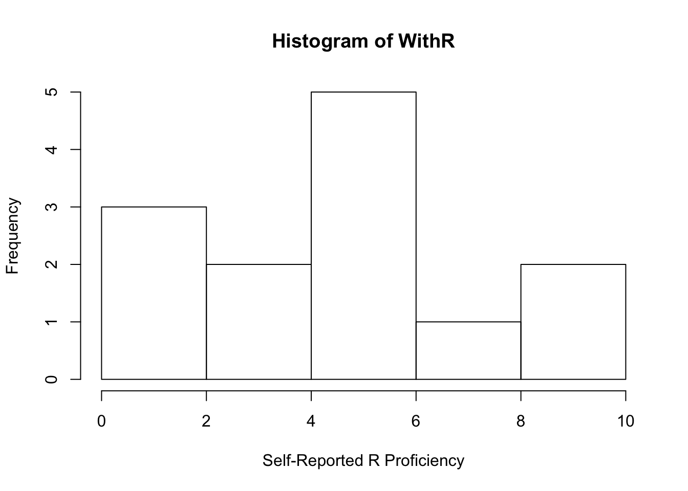
Note: R is case-sensitive and unforgiving!
Getting Data Into R
Now make sure to place your “StripeRust.csv” file in the working directory that we set, then load the data in using the “read.csv” function.
RustData <- read.csv("StripeRust.csv", header = TRUE)
  #Header = TRUE lets R know that we have headings in the first row of our data set.

head(RustData) ## check the first few rows of the dataset
## Year DAI Severity
## 1 Year 1 10 0
## 2 Year 1 20 0
## 3 Year 1 30 0
## 4 Year 1 40 3
## 5 Year 1 50 20
## 6 Year 1 60 50names(RustData) ## check the column headers## [1] "Year" "DAI" "Severity"Note: this data is disease severity ratings taken in a wheat stripe rust nursury over the course of two seasons. “DAI” = days after inoculation.
Some quick plotting
First, lets do some fun stuff! To get started, install the package “ggplot2”. Packages are toolboxes that include functions, data and code for specific tasks. Note, remove the “#” from before install.packages() to load for the first time. The “#” comments out any code so it will not be run.
#install.packages("ggplot2")
library(ggplot2)
Note: if you have installed an R package once on your computer, you will not need to install it again. You will need to load the library at the begining of each new session using the library() function
We can plot this data using ggplot2 (we will learn more about this later!). Tell the graphing function to use the data “RustData” that we called above, and then add a layer to the plot with the geom_point() function with severity on the y axis and year on the x axis. Color the points by the year that data was collected.
ggplot(data = RustData) +
  geom_point(mapping = aes(x = DAI, y = Severity, color = Year))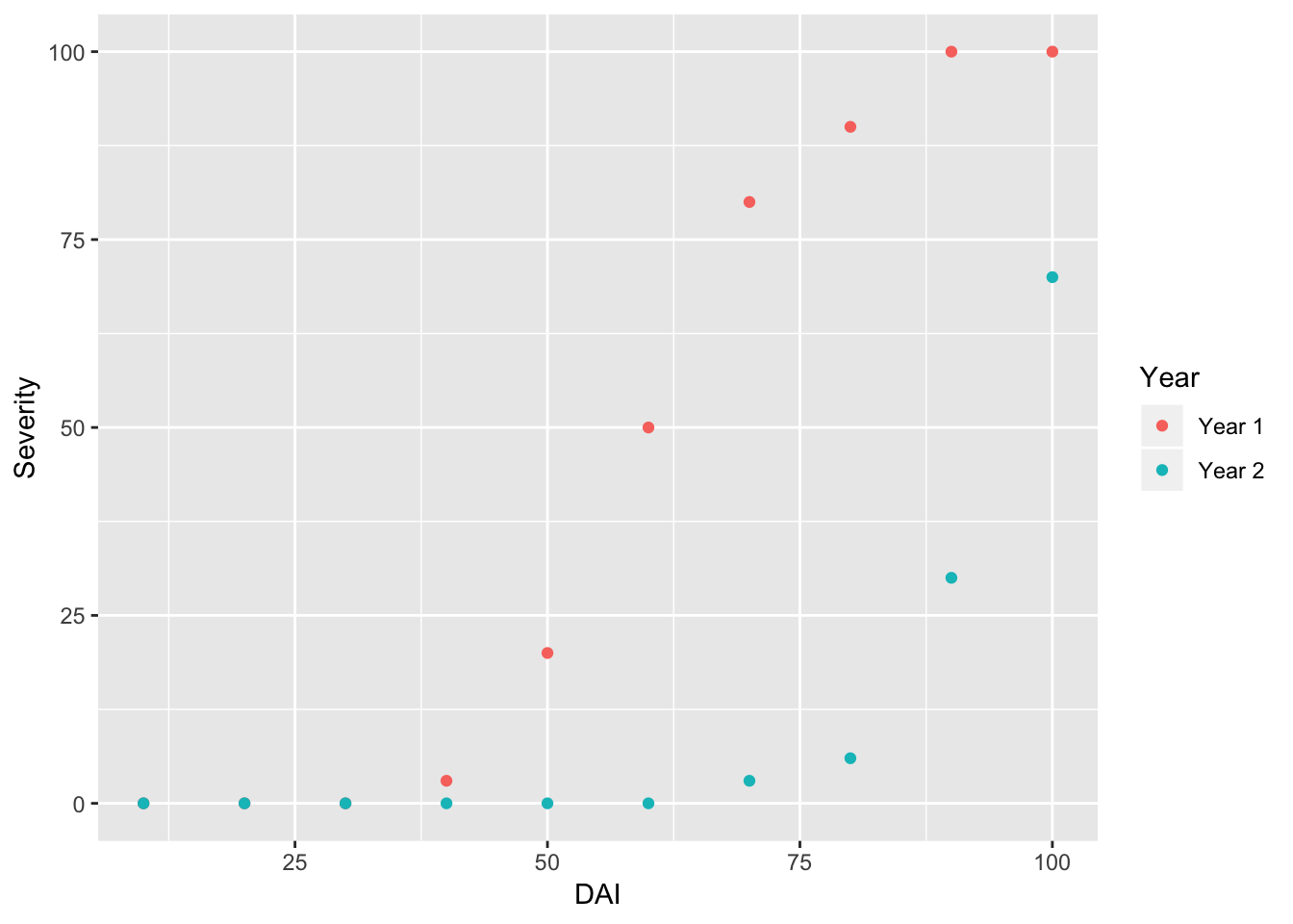
Note: It looks like disease took longer to develop in year 2, and was less severe by day 100.
If we switch from the function “geom_point” to “geom_line” we can plot lines and not points.
ggplot(data = RustData) +
  geom_line(mapping = aes(x = DAI, y = Severity, color = Year))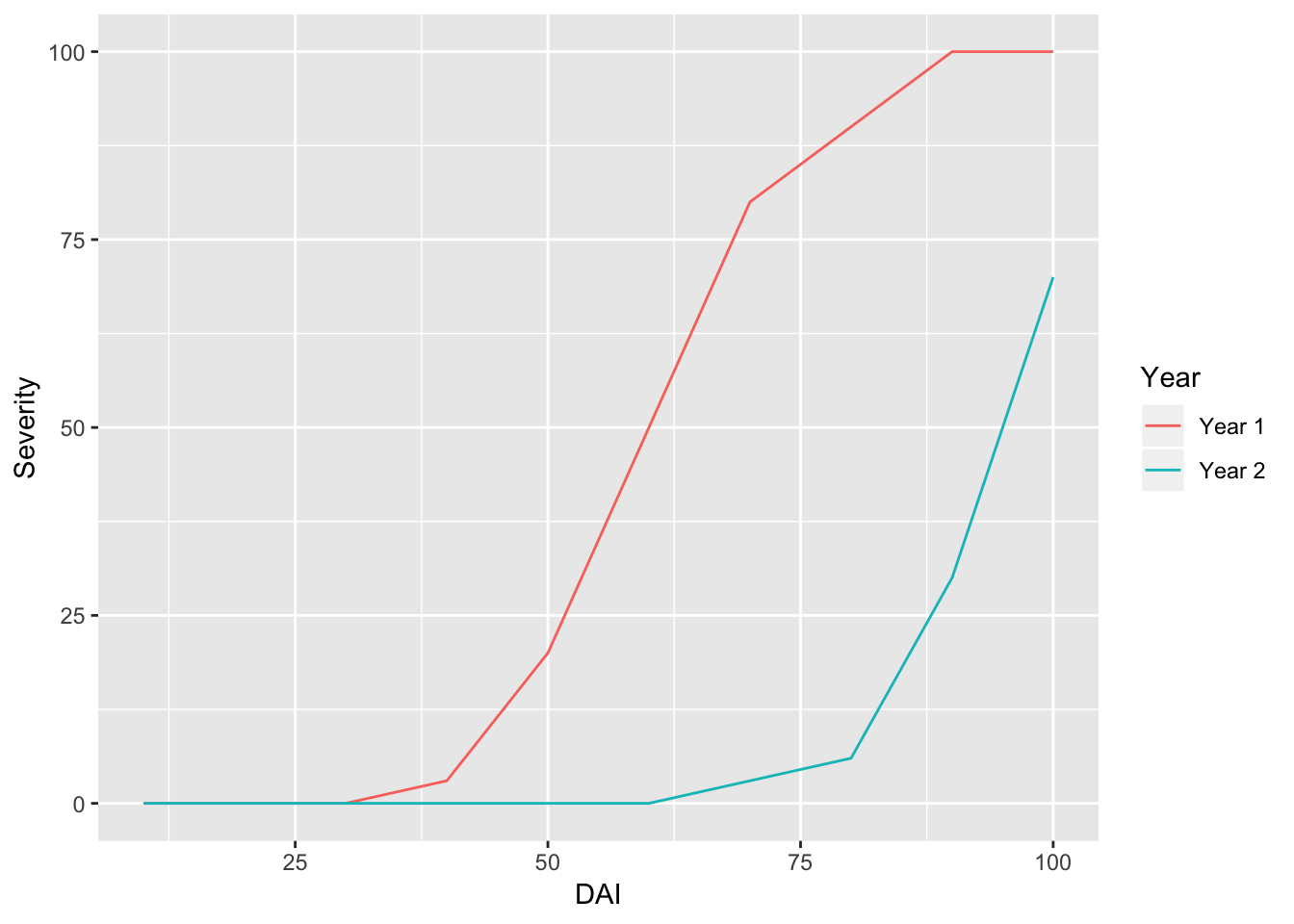
We can look at the graphs side-by-side using the facet_wrap() function.
ggplot(data = RustData) +
  geom_point(mapping = aes(x = DAI, y = Severity)) +
  facet_wrap(~Year)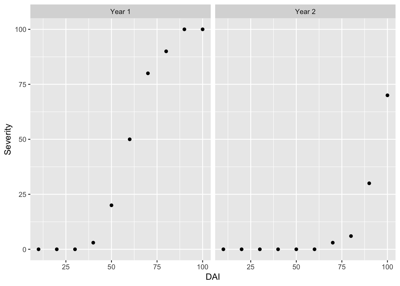
Note: be sure to include a “+” at the end of each line, until you want to close the command.
Finally, lets add a title!
ggplot(data = RustData) +
  geom_point(mapping = aes(x = DAI, y = Severity, color = Year)) +
  facet_wrap(~Year) +
  labs(title = "Stripe Rust Severity Over Time")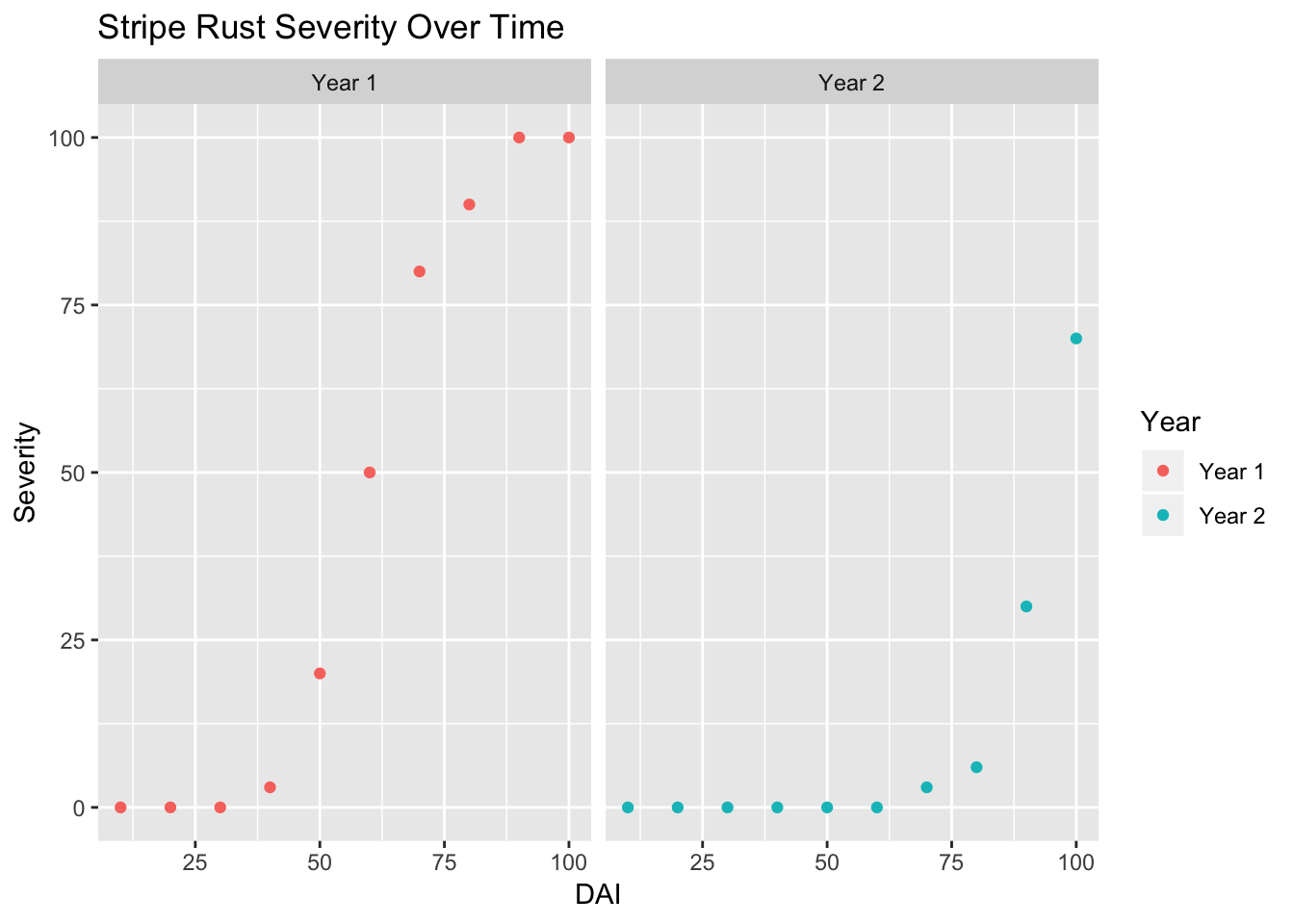
Introduction to Tidyverse
Tidyverse is actually an ecosystem of R packages that make organizing and visualizing your data easier.
# load the library tidyverse
library(tidyverse)
Dataset
In this module we will be using Iris flower dataset to learn the tools for data wrangling by using dplyr package. Similarly, we will use Iris dataset for exploring some of the basic plots using ggplot2. Both of these packages are the part of tidyverse package. So, if you have tidyverse loaded then you are ready to go!
Iris data comes with base R i.e., it is a build-in dataset. Let’s load the data first. You can do that by using data function.
# load data
data(iris)

# check the first 6 rows of the data
head(iris)
## Sepal.Length Sepal.Width Petal.Length Petal.Width Species
## 1 5.1 3.5 1.4 0.2 setosa
## 2 4.9 3.0 1.4 0.2 setosa
## 3 4.7 3.2 1.3 0.2 setosa
## 4 4.6 3.1 1.5 0.2 setosa
## 5 5.0 3.6 1.4 0.2 setosa
## 6 5.4 3.9 1.7 0.4 setosa# check the structure of data. Very handy function to get a basic information about the data.
str(iris)## 'data.frame': 150 obs. of 5 variables:
## $ Sepal.Length: num 5.1 4.9 4.7 4.6 5 5.4 4.6 5 4.4 4.9 ...
## $ Sepal.Width : num 3.5 3 3.2 3.1 3.6 3.9 3.4 3.4 2.9 3.1 ...
## $ Petal.Length: num 1.4 1.4 1.3 1.5 1.4 1.7 1.4 1.5 1.4 1.5 ...
## $ Petal.Width : num 0.2 0.2 0.2 0.2 0.2 0.4 0.3 0.2 0.2 0.1 ...
## $ Species : Factor w/ 3 levels "setosa","versicolor",..: 1 1 1 1 1 1 1 1 1 1 ...When you read in your data it is typically in the form of a data frame. In the tidyverse world a data frame is called a tibble. You can conceptualize it as table with some extra information on the data types.
# create tibble format table
df <- as.tibble(iris)
## Warning: `as.tibble()` is deprecated, use `as_tibble()` (but mind the new semantics).
## This warning is displayed once per session.df## # A tibble: 150 x 5
## Sepal.Length Sepal.Width Petal.Length Petal.Width Species
## <dbl> <dbl> <dbl> <dbl> <fct>
## 1 5.1 3.5 1.4 0.2 setosa
## 2 4.9 3 1.4 0.2 setosa
## 3 4.7 3.2 1.3 0.2 setosa
## 4 4.6 3.1 1.5 0.2 setosa
## 5 5 3.6 1.4 0.2 setosa
## 6 5.4 3.9 1.7 0.4 setosa
## 7 4.6 3.4 1.4 0.3 setosa
## 8 5 3.4 1.5 0.2 setosa
## 9 4.4 2.9 1.4 0.2 setosa
## 10 4.9 3.1 1.5 0.1 setosa
## # … with 140 more rowsFilter()
If you check the header of this tibble, then you can see it contains information on the class of data contained within the column. For example, information in the Species column of Iris data is factor.
Now lets dive into the package dplyr a little more, and work on data wrangling part. We all have data that is in one format that we need to have in another format to use for our analysis. Data cleaning or organizing is essential for downstream analysis. Luckily, dplyr has intuitive functions to help you..
Let say if you want to filter the Iris dataset, where Species are versicolor. Then you can use the function filter().
# Filter rows with filter()
# here df is the object where we had store our tibble data
# yes, you need to use double equals (==)
filter(df, Species == "versicolor")
## # A tibble: 50 x 5
## Sepal.Length Sepal.Width Petal.Length Petal.Width Species
## <dbl> <dbl> <dbl> <dbl> <fct>
## 1 7 3.2 4.7 1.4 versicolor
## 2 6.4 3.2 4.5 1.5 versicolor
## 3 6.9 3.1 4.9 1.5 versicolor
## 4 5.5 2.3 4 1.3 versicolor
## 5 6.5 2.8 4.6 1.5 versicolor
## 6 5.7 2.8 4.5 1.3 versicolor
## 7 6.3 3.3 4.7 1.6 versicolor
## 8 4.9 2.4 3.3 1 versicolor
## 9 6.6 2.9 4.6 1.3 versicolor
## 10 5.2 2.7 3.9 1.4 versicolor
## # … with 40 more rowsYou can also filter your dataset with conditional requirements. Here, let’s say, we want to select all flower data with petal length that is greater than 2.
# Comparisons
filter(df, Petal.Length > 2)
## # A tibble: 100 x 5
## Sepal.Length Sepal.Width Petal.Length Petal.Width Species
## <dbl> <dbl> <dbl> <dbl> <fct>
## 1 7 3.2 4.7 1.4 versicolor
## 2 6.4 3.2 4.5 1.5 versicolor
## 3 6.9 3.1 4.9 1.5 versicolor
## 4 5.5 2.3 4 1.3 versicolor
## 5 6.5 2.8 4.6 1.5 versicolor
## 6 5.7 2.8 4.5 1.3 versicolor
## 7 6.3 3.3 4.7 1.6 versicolor
## 8 4.9 2.4 3.3 1 versicolor
## 9 6.6 2.9 4.6 1.3 versicolor
## 10 5.2 2.7 3.9 1.4 versicolor
## # … with 90 more rowsYou can also filter based on multiple conditions.
# Logical operators
filter(df, Petal.Length > 6 & Sepal.Length > 7)
## # A tibble: 9 x 5
## Sepal.Length Sepal.Width Petal.Length Petal.Width Species
## <dbl> <dbl> <dbl> <dbl> <fct>
## 1 7.6 3 6.6 2.1 virginica
## 2 7.3 2.9 6.3 1.8 virginica
## 3 7.2 3.6 6.1 2.5 virginica
## 4 7.7 3.8 6.7 2.2 virginica
## 5 7.7 2.6 6.9 2.3 virginica
## 6 7.7 2.8 6.7 2 virginica
## 7 7.4 2.8 6.1 1.9 virginica
## 8 7.9 3.8 6.4 2 virginica
## 9 7.7 3 6.1 2.3 virginicaArrange()
Dataset is filtered based on both the criteria, and only the entries that match the set conditions are displayed.
Now, rather than filtering data with the desired criteria, we can also arrange them in our desired order- by using arrange function.
# arrange by sepal length then petal width. Default is ascending order.
arrange(df, Sepal.Length, Petal.Width)
## # A tibble: 150 x 5
## Sepal.Length Sepal.Width Petal.Length Petal.Width Species
## <dbl> <dbl> <dbl> <dbl> <fct>
## 1 4.3 3 1.1 0.1 setosa
## 2 4.4 2.9 1.4 0.2 setosa
## 3 4.4 3 1.3 0.2 setosa
## 4 4.4 3.2 1.3 0.2 setosa
## 5 4.5 2.3 1.3 0.3 setosa
## 6 4.6 3.1 1.5 0.2 setosa
## 7 4.6 3.6 1 0.2 setosa
## 8 4.6 3.2 1.4 0.2 setosa
## 9 4.6 3.4 1.4 0.3 setosa
## 10 4.7 3.2 1.3 0.2 setosa
## # … with 140 more rows# allows to arrange in descending order if we add desc() in front of the column name that we want to sort by
arrange(df, desc(Sepal.Length))## # A tibble: 150 x 5
## Sepal.Length Sepal.Width Petal.Length Petal.Width Species
## <dbl> <dbl> <dbl> <dbl> <fct>
## 1 7.9 3.8 6.4 2 virginica
## 2 7.7 3.8 6.7 2.2 virginica
## 3 7.7 2.6 6.9 2.3 virginica
## 4 7.7 2.8 6.7 2 virginica
## 5 7.7 3 6.1 2.3 virginica
## 6 7.6 3 6.6 2.1 virginica
## 7 7.4 2.8 6.1 1.9 virginica
## 8 7.3 2.9 6.3 1.8 virginica
## 9 7.2 3.6 6.1 2.5 virginica
## 10 7.2 3.2 6 1.8 virginica
## # … with 140 more rowsSelect()
Unlike filter, if you want to take a subset of data, and study them separately then you can use select() function to get a subset of data columns.
# from iris data, lets select only three columns - Species, Petal width and Petal length
select(df, Species, Petal.Width, Petal.Length)
## # A tibble: 150 x 3
## Species Petal.Width Petal.Length
## <fct> <dbl> <dbl>
## 1 setosa 0.2 1.4
## 2 setosa 0.2 1.4
## 3 setosa 0.2 1.3
## 4 setosa 0.2 1.5
## 5 setosa 0.2 1.4
## 6 setosa 0.4 1.7
## 7 setosa 0.3 1.4
## 8 setosa 0.2 1.5
## 9 setosa 0.2 1.4
## 10 setosa 0.1 1.5
## # … with 140 more rowsThere may be times when you want to add an aditional, calculated column to your data. Here log.Sepal.length is a name of a new column, and in this column we will be storing the log(Sepal.Length) values.
mutate(df, log.Sepal.length = log(Sepal.Length))## # A tibble: 150 x 6
## Sepal.Length Sepal.Width Petal.Length Petal.Width Species
## <dbl> <dbl> <dbl> <dbl> <fct>
## 1 5.1 3.5 1.4 0.2 setosa
## 2 4.9 3 1.4 0.2 setosa
## 3 4.7 3.2 1.3 0.2 setosa
## 4 4.6 3.1 1.5 0.2 setosa
## 5 5 3.6 1.4 0.2 setosa
## 6 5.4 3.9 1.7 0.4 setosa
## 7 4.6 3.4 1.4 0.3 setosa
## 8 5 3.4 1.5 0.2 setosa
## 9 4.4 2.9 1.4 0.2 setosa
## 10 4.9 3.1 1.5 0.1 setosa
## # … with 140 more rows, and 1 more variable: log.Sepal.length <dbl>Another important function in dplyr is summarise(). This function allows you get summary information about the data. In the example below, we first group entries by flower species, then calculate mean petal length for each species of flower.
Summarise()
# find mean of peteal length
summarise(df, mean(Petal.Length))
## # A tibble: 1 x 1
## `mean(Petal.Length)`
## <dbl>
## 1 3.76# find mean of petal length for each species
group_by(df, Species) %>% count(n())## # A tibble: 3 x 3
## # Groups: Species [3]
## Species `n()` n
## <fct> <int> <int>
## 1 setosa 50 50
## 2 versicolor 50 50
## 3 virginica 50 50df %>%
group_by(Species) %>%
summarise(mean(Petal.Length))## # A tibble: 3 x 2
## Species `mean(Petal.Length)`
## <fct> <dbl>
## 1 setosa 1.46
## 2 versicolor 4.26
## 3 virginica 5.55Did you notice %>% symbol? What is that? This symbol is called pipe. Yes… pipe because as the name implies, it takes in output from one operation then pass/pipe it as an input for next operation. Advantage: No need to create new object to store values at each operation.
Now you know how to organize or clean data, which means you have become a “Data Scientist”. Data science would be incomplete without good visualization tools. So, now we will explore some of the very basic plots using ggplot2 package.
Since you know so much about Iris flower data, we will use the same one for learning visualizations. However, you can use the same concepts while analyzing your own data.
ggplot
Let’s see the figure first!!!
#1 Scatter PLot
ggplot(data=df, aes(x = Sepal.Length, y = Sepal.Width))+
  geom_point(aes(color=Species, shape=Species)) +
  xlab("Sepal Length") +
  ylab("Sepal Width") +
  ggtitle("Sepal Length-Width")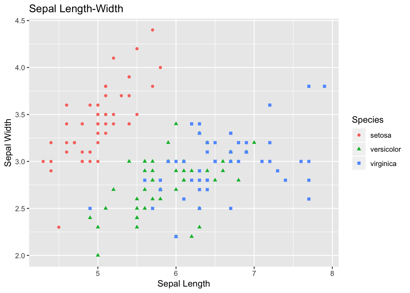
The plot that you just plotted is called scatter plot. Let’s follow the code briefly. If you understand this code, then the rest of code for visualization is based on similar concept.
Here, in data you are specifying df, which is our tibble format Iris data. Then, with aes we are specifying what we want in X- and Y-axes. Sepal length is used as X-axis, and Sepal width as Y-axis.
So far, we have informed R the backbone of our plot.
geom() is used to specify what kind of plot that we want. For scatter plot we want geom_point(). If we want bar plot, then geom_bar, and there are many other options.
With-in geom_point we are adding more information for the points. We want each point to be colored and shaped according to the flower species.
+ is used to add each layer of information.
The other handy plot is box plot- this can be used to look the spread of data. For the code part, the logic is same as of scatter plot, but this time we need to use geom_boxplot().
Additionally, we can use + sign and add some summary statistics within the plot. Here, we want to display mean for each flower species within the boxplot. You can modify the shape and size parameters.
# 2) Box Plot

box <- ggplot(data=df, aes(x=Species, y=Sepal.Length))

box +
  geom_boxplot(aes(fill=Species)) +
  ylab("Sepal Length") +
  ggtitle("Iris Boxplot") +
  stat_summary(fun.y=mean, geom="point", shape=5, size=4)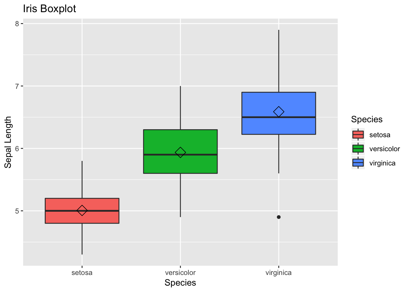
Histograms allow to look the data distribution. Histograms are commonly used in exploratory analysis. You can also modify the bin size and check for irregular trends (outliers) in the data - on your own.
Note- we need to change geom type— here we use geom_histogram
# 3) Histogram
histogram <- ggplot(data=df, aes(x=Sepal.Width))

histogram +
  geom_histogram(binwidth=0.2, color="black", aes(fill=Species)) +
  xlab("Sepal Width") +
  ylab("Frequency") +
  ggtitle("Histogram of Sepal Width")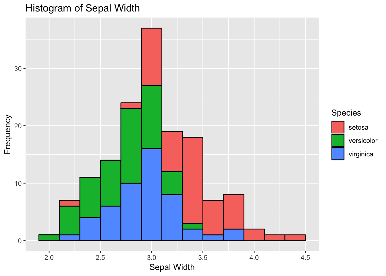
Barplot– we don;t even have to mention about it. You have seen it, and use it. Let’s plot in ggplot2. Again, we need to specify geom type- as geom_bar
# 4) bar plot
bar <- ggplot(data=df, aes(x=Species))

bar +
  geom_bar(aes(fill=Species)) + xlab("Species") +
  ylab("Count") +
ggtitle("Bar plot of Sepal Length") 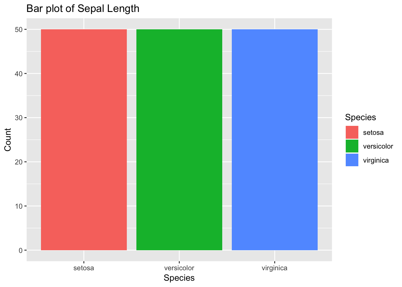
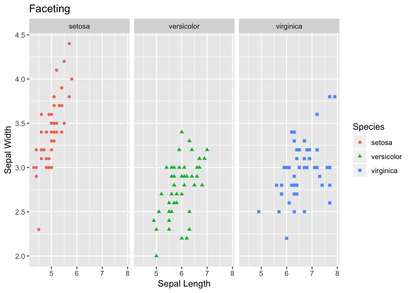
Additionally, another interesting and handy plotting tool is facet. Facet allows to get a separate panel for each category. As you can see in the plot below, we get three panels - one for each species of flower.
# 5) Faceting
facet <- ggplot(data=df, aes(Sepal.Length, y=Sepal.Width, color=Species)) +
  geom_point(aes(shape=Species), size=1.5) +
  xlab("Sepal Length") +
  ylab("Sepal Width") +
  ggtitle("Faceting")
# Along columns
facet + facet_grid(. ~ Species)